The Artist Army

Join or create fan clubs about your favorite things!

Re: The Artist Army

Postby MacGyver » Tue Jun 10, 2014 8:32 am

      @mathematiics: You've got a good start on it. Just one thing, I think her mouth could be a teeny bit more to the left.
      @Nix: Looks great! as someone who fails at digital art, I'm jealous. xP I really like your background texture.
      @Ace: OMG I love your style! So cute! Hm, I see commissions are open. owo *runs off to inbox to PM*
      @Friskusis: Wow both pieces are amazing! I really can't give any critique. I'm in love with that first piece <3
      @Star Fox: I think Friskusis's redline pretty much nailed what I was thinking about your second piece. With the first one...the shoulder and the front legs look a bit off to me. I think it's the angle.
      @The WalkingDead: Fantastic job! You got Ariel spot on! ^^

      Question: How much do you all think is a fair hourly wage for an artist? Of, say, this level?
      -I wasn't sure where else to ask. ;v;


      And while I'm here, I was wondering if I could get some critique on these pieces?
Image
Image Image
████████████████████████ ███ ███ █████
• • • • • • • • • • • • • • • • • • • • • • • • • • • • • • • • •
Image
▰ ▰ ▰ ▰ ▰ ▰ ▰ ▰ ▰ ▰ ▰ ▰ ▰ ▰ ▰ ▰ ▰ ▰ ▰ ▰ ▰ ▰ ▰ ▰

█████ ███ ███ ████████████████████████
▪ ▪ ▪ ▪ ▪ ▪ ▪ ▪ ▪ ▪ ▪ ▪ ▪ ▪ ▪ ▪ ▪ ▪ ▪ ▪ ▪ ▪ ▪ ▪ ▪ ▪ ▪ ▪ ▪ ▪ ▪ ▪ ▪ ▪ ▪ ▪ ▪ ▪ ▪ ▪
Image Image Image Image Image
• • • • • • • • • • • • • • • • • • • • • • • • • • • • • • • • •
DIXIE INSTA ART


..........................
ɪ ᴀᴍ ᴛʜᴇ ᴍᴀᴅ ᴋᴇᴇᴘᴇʀ
HaruMakoNagisa
ReiRinMomo
SousukeNitori

.........................

CSCC Iwatobi Dog Chat

Image
Image


WIP
User avatar
MacGyver
 
Posts: 10495
Joined: Sat Jan 21, 2012 6:16 am
My pets
My items
My wishlist
My gallery
My scenes
My dressups
Trade with me

Re: The Artist Army

Postby AcetheKidd » Tue Jun 10, 2014 9:04 am

Thank so much guys! I'll to be much better next time so thanks for the tips

@nix : eek! Omg, i love it. Nice job on the glowing effects

@Math: i like it :3 i wish i could draw humans

@ Mac: holy...the first two are amazing! My, my the shading is amazing

Also guys, im working on pixel art. How is this?

Image
Image
User avatar
AcetheKidd
 
Posts: 30853
Joined: Thu May 02, 2013 2:57 pm
My pets
My items
My wishlist
My gallery
My scenes
My dressups
Trade with me

Re: The Artist Army

Postby Solarizing » Wed Jun 11, 2014 2:21 am

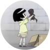
Hello everyone! I've been away from this club for awhile. I re-read the rules, however, and I'm happy to give critique on everyone's artwork. =)

AcetheKidd : Very nice! I really enjoy the color and shading in this piece, and I love the pose, your style is coming along nicely. If you want to improve I would suggest focusing on anatomy. (That's generally my problem too. Anatomy's annoying but once you get it down your art will improve greatly.) I think your piece could also benefit from highlights or shading that suggests the texture a bit better. There are some good tutorials on deviantArt like this one that you could check out. Using photo references and tutorials are really helpful. Keep working hard at it, you're off to a great start!

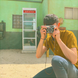
MacGyver : Your artwork is really impressive, you've definitely nailed that realism. I'm not good at pricing, but I recommend you'd make a formula for yourself. Consider how long it takes you to work, how much your supplies cost, and make sure you're making enough profit off of it. Personally I would charge $10-$20 an hour for artwork of that quality, but that's a really rough guess and I'm not the best person to ask, as I don't have a whole lot of experience with commissions right now. ^^'

Your first two pieces are really impressive. As you said, I think you could use a little more practice with wings, and I'd recommend doing some "studies" by practicing drawing birds. There's a slight anatomy error in your first piece, the eyes were a little off, I think, but it's not bad. Your third piece is looking great but it seems relatively flat, I would practice with your shading and lighting a little more to make it more eye-catching.

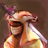
mathematics : I really like your style, you have a lot of expression and character portrayed in this drawing, it looks amazing. Your anatomy is slightly off but it's extremely minor, I honestly think you just need to tweak the shape of the chin and possibly the position of the nose, then you'll be perfect. Your hair could be a shaped a little better, especially where the bun is. I would look up some tutorials on hair. The headphones seem a little flat and I would redraw them to make them a little more bulky and 3-D. Again, you really have a sweet style, and I'd love to see more from you. ^_^

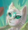
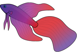
Nix Jazz Tempesedo : Okay, that's a really cool character. You really captured him nicely, there's so much personality and just plain awesomeness in this piece and I love it. I like your color scheme and style but I think you need to work on making your shading and highlights more interesting, right now there's not a whole lot of texture or detail and I just feel like you could use shading better to add a good impact with this piece. You should also play around with your purple glow and make it look a little more eye-catching, maybe make it sparkly or sort of give it an effect, I don't know. Here's a nice tutorial on shading, it might help you: 
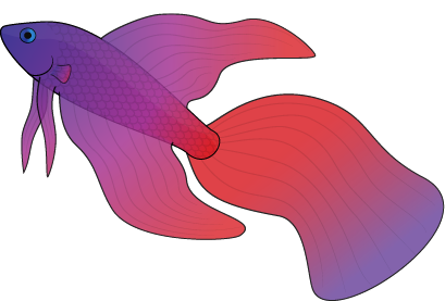
http://solardaemon.deviantart.com/art/G ... -251104611

AcetheKidd (again) : Your lizard is adorable, I love the pose and the legs and ahh it's so cute. =D The MLP FC is cute too but it isn't posed as nicely as the lizard is, in my opinion. I really love your cartoon art and I just think you need to work on shading. =) Very good.

Friskusis : Oh wow, I'm really in love with your style, I'm going to go check out your dA after I type this. Your shading and highlighting is really impressive and I just like your art overall a lot. The background in the second picture is really good, it definitely adds to your art. I would work on making your poses a little more interesting and just working on making the art more eye-catching overall. It's really amazing right now, good job.

Alright... that's ten! Could I please have some crit on my recent piece of LOCW_Bluestarwarrior's character, Evan Bane? Don't be afraid to be harsh, I really want to improve and I won't take it personally. ;D

http://solardaemon.deviantart.com/art/L ... -459467720

That piece with Evan is what I really want critique on, but if you have time, I'd love some response to this artwork as well:

http://solardaemon.deviantart.com/art/M ... -458746762

Thank you!
▬▬▬▬▬▬▬▬▬▬▬▬▬▬▬
𝕊 𝕆 𝕃 𝔸
xxxxxxxxxxxxxxxxxxx
Artist and writer.
Former Oekaki mod.
Still drawing cats.

xxxxxxxxxxxxxxxxxxx
▬▬▬▬▬▬▬▬▬▬▬▬▬▬▬
Image
User avatar
Solarizing
 
Posts: 14091
Joined: Mon Feb 22, 2010 9:12 am
My pets
My items
My wishlist
My gallery
My scenes
My dressups
Trade with me

Re: The Artist Army

Postby kirill » Wed Jun 18, 2014 1:03 pm

Image
xImage
| dA | youtube | comms | | |
---
kirill///they/them///i used to be katstiel
---
i'm not active anymore, find me on other social medias as @kirilldraws
---

| art credit ;; | photo | avatar & art | pixels


ImageImage
User avatar
kirill
 
Posts: 9406
Joined: Fri Jul 29, 2011 4:41 am
My pets
My items
My wishlist
My gallery
My scenes
My dressups
Trade with me

Re: The Artist Army

Postby MacGyver » Sun Jun 29, 2014 4:31 pm

      Hello again, everyone.

      I'm not sure if I'm allowed to ask a question without first commenting on others' art (if so, please let me know!).
      But I'm here for advice and help, please! c:

      I'm renting a booth shared with my sister [GhostE] at a comic-con coming up in November. Has anyone here ever been involved in an art show or comicon? What should I be doing to prepare?
      Does anyone know where I could have prints done of my work and how much it might cost me?

      I'm hopefully going to have a minimum of 25 portraits finished before the con. I'm also going to buy some art sleeves (I can 25 [11x14] for $5), and may be having some business cards printed up.

      Any tips, advice or help is appreciated! I'd also love to hear any experiences!


      PS. Thanks all for the critique!!
Image
Image Image
████████████████████████ ███ ███ █████
• • • • • • • • • • • • • • • • • • • • • • • • • • • • • • • • •
Image
▰ ▰ ▰ ▰ ▰ ▰ ▰ ▰ ▰ ▰ ▰ ▰ ▰ ▰ ▰ ▰ ▰ ▰ ▰ ▰ ▰ ▰ ▰ ▰

█████ ███ ███ ████████████████████████
▪ ▪ ▪ ▪ ▪ ▪ ▪ ▪ ▪ ▪ ▪ ▪ ▪ ▪ ▪ ▪ ▪ ▪ ▪ ▪ ▪ ▪ ▪ ▪ ▪ ▪ ▪ ▪ ▪ ▪ ▪ ▪ ▪ ▪ ▪ ▪ ▪ ▪ ▪ ▪
Image Image Image Image Image
• • • • • • • • • • • • • • • • • • • • • • • • • • • • • • • • •
DIXIE INSTA ART


..........................
ɪ ᴀᴍ ᴛʜᴇ ᴍᴀᴅ ᴋᴇᴇᴘᴇʀ
HaruMakoNagisa
ReiRinMomo
SousukeNitori

.........................

CSCC Iwatobi Dog Chat

Image
Image


WIP
User avatar
MacGyver
 
Posts: 10495
Joined: Sat Jan 21, 2012 6:16 am
My pets
My items
My wishlist
My gallery
My scenes
My dressups
Trade with me

Re: The Artist Army

Postby vanitas. » Sun Jun 29, 2014 6:51 pm

@AcetheKidd it looks good so far! Some of the anatomy is slightly off but it looks great :D

@SolarDaemon for the human art, the head is a bit too small for such a long body. Hands are also off but hey, I'm not any better xD. Also, you should work on the front of his jeans, it kind of looks like wearing looking at his bum, remember, boys are boys sooo...references are always helpful uwu

@katstiel hmmm, darker shading and more lighting would probably make it seem more 'finished'

@MacGyver I've never done any of that so I couldn't really, I'm sorry ;-;

Alright, I need helllpppp, well, kind of ewe

I don't know how many of you know what Invader Zim is or what Irkens are but this is what this art is about

Art Trade~
Another Art Trade~
Animation~

Just looking for comments or critics ewe
Thank you ~!
🧿
      Imagexxxxxxxxxxxxxxxxxxxxxxxxxxxx

      O
      U
      R

      B
      L
      U
      E


      xxxxxxxxxxxxxxxxxxxxxxxxxxxxxxxxxxxxxxxxxx
      "WE'LL SEE EACH OTHER AGAIN, WON'T WE?"

      ──────────────────────
      VANI • ADULT • THEY/THEM • ARTART SHOP
      シャシャ

      ░░☂░░░░░░░░░░░░░░
      xxxxxxxxxxxxxxxxxxxxxxxxxxxxxxxxxxxxxxxxxx
User avatar
vanitas.
 
Posts: 15887
Joined: Fri Mar 26, 2010 11:08 am
My pets
My items
My wishlist
My gallery
My scenes
My dressups
Trade with me

Re: The Artist Army

Postby Ciriun » Sun Jun 29, 2014 11:53 pm

@SolarDaemon, I agree with Shasha on the head, and the right hand could use a longer palm and maybe slightly shorter fingers. Hands really are the worst, aren't they?

@MacGyver, Congratulations! Sadly, I only know about cons from the buyer's perspective, so about all I can say is that if you have the ability to do so you might want to consider making something small in addition to full size prints. Bookmarks are good and simple, but I have no idea if lamination is worth the cost. Large batches of wallet sized, cute drawings that you can print out a big pile of would also work.

Rambling slightly, my favorite booth at an anime con I used to go to sold tiny little bunny magnets. They probably had a hundred or more different ones, I think it was probably 4-5 for a dollar. I had to buy a batch every time. XD

@Shasha~Chibi, I am vaguely familiar with Invader Zim, but not well enough to say more than that your art seems to be accurate to the style.

---------------------------------------

So no centaurs this time, just fish. The first one is just to show detail, the second one is the adoptable, though I might make both sizes or something close to them available. Redlines welcome, but they are not supposed to look exactly like real bettas. The fins are supposed to be more cloudy shaped, sort of ethereal and dreamy. My biggest problems are that I can't get the highlights right, and I'm not sure if the scales look good in the small size.

Image Image

Any advice is appreciated. :)


---Image---
Adopt a Teamaid at Mythicarium!
Click the teacup to see!


User avatar
Ciriun
 
Posts: 2513
Joined: Mon Sep 22, 2008 1:47 pm
My pets
My items
My wishlist
My gallery
My scenes
My dressups
Trade with me

Re: The Artist Army

Postby Fenric » Wed Jul 02, 2014 2:28 pm

Ciriun; I think both versions look pretty good. Nice colors c:

Shasha; It looks pretty accurate to the show, but I'm not an expert on Invader Zim. I would say that the lines seem a bit crude and need to be smoother or less bold, but the shading and lighting is simplistic and nice. (I do think that the show's intention is to look sort of crude/bold though...) I like it a lot. Your animation skills are really good.

Gyver; Sorry, not really sure ^_^'
But to your art pieces, you're wonderful with realism! I especially love the Leila picture, because the dark fur contrasts with the light wings very nicely~

Solar; Both pieces of art are stunning! The shading and anatomy are fantastic. I have no complaints.

Acethekid; Looks pretty good to me!

Math; Looks really good, and has a lot of potential. I'm not really good at drawing humans though, so I can't really critique it. I would say it's mostly flawless, but the face seems sort of slanted to the right... But really, that's just nitpicking. It's a lot better than I can do.

Nix; That character really seems cool, if his attitude is anything to judge by~ Nice work!


Image
This is my interpretation of the My Little Pony version of a Changeling. Should I make the picture less grainy, or leave it as it is?
I'm mostly using the white noise effect for atmosphere, and to compensate for my lack of ability to draw a concrete background...

Also, you may critique other areas like the anatomy and such...
Here is the flat colored version so you can see all of the creature
Image
Image

CHAOS, CHAOS! I CAN DO ANYTHING!
Image


Image

★ ★ ★ ★ ★ ★
Adult player - he/him
★ ★ ★ ★ ★ ★

trades / collection


Image
User avatar
Fenric
 
Posts: 8451
Joined: Fri Jul 06, 2012 12:41 pm
My pets
My items
My wishlist
My gallery
My scenes
My dressups
Trade with me

Re: The Artist Army

Postby jellykiwi » Fri Jul 04, 2014 1:19 pm

@Solar Daemon - 1st piece: that lightning and lighting look amazing 'w' the background looks very nice, too; I really like how you drew the moon and the patch of shading in the grass. as far as anatomy goes, I think the proportions are off. the head looks too small for the body and the bend between the torso and his left arm looks a bit wonky. but other than that, it looks great! :>
2nd piece: again, awesome background and shading. I really love how you drew the eyes *v* however, one thing that stands out to me is the bend of the its left front leg; it looks a bit noodle-y and long compared to the its right front leg. overall, the piece has a lot of action and character which makes it interesting to look at uvu

@katstiel - that's a really great piece! the fur looks so soft 'v' I definitely agree with more pronounced/darker shading. anatomy-wise, I do think the neck/chest area should be a bit thicker to support the head; it looks a bit top-heavy right now uvu

@MacGyver - unfortunately, I've never been to a comicon so I have no advice for you, but I hope everything goes well!

@Shasha~chibi - I've never watched Invader Zim so I can't critique those pieces, but they look very nice! uvu that eye animation is so smooth!

@Ciriun - those bettas look gorgeous! *v* I really like the scales; I feel they more texture and make them really pop

@Tanetane - wow, that picture is really cool! I especially love the detail in the jaw area :u I feel like the grainyness really adds to the harsh atmosphere of the piece uvu
twitter
Image
watch me grow!!
User avatar
jellykiwi
 
Posts: 6358
Joined: Sat Oct 10, 2009 12:10 pm
My pets
My items
My wishlist
My gallery
My scenes
My dressups
Trade with me

Re: The Artist Army

Postby Yuki. » Sun Jul 06, 2014 4:17 pm

Ace the kid, thats cute! Really cool! The only major thing that stands out to me is his hand. The fingernails seem too large and his hand just kind of has a straight line to the sleeve. Other than that I love the design and the pixels <3


So I have an issue. I cant really draw digitally, but I can traditionally. However, it becomes a huge problem getting that finished traditional piece turned into something digital that i can send commissioners. I kind of stopped my art shop because i was afraid the quality was low. Does anyone have any idea how to get that clear picture. Like its not so much when i ink, but when i commission sketches i tend to sketch lighter and i have some parts that barely show up so i will have to darken it but the it darkens spots on the paper and the whole thing turns into a mess. Does anyone have any tips? Thanks!
~Yuki
Image


User avatar
Yuki.
 
Posts: 8201
Joined: Sun Dec 13, 2009 8:47 am
My pets
My items
My wishlist
My gallery
My scenes
My dressups
Trade with me

Who is online

Users browsing this forum: No registered users and 11 guests