Announcements about events or changes to the website and forum
 by dwarjam » Fri Apr 05, 2019 12:40 am
Frostseraph wrote:As a mobile exclusive user, I love the bigger buttons. Massive help to not have to zoom in anymore, cannot tell you how many times I've clicked gallery while trying to click trade with this user. But I do understand the complaints and agree maybe there should be an opt out option.
I also mentioned it in my earlier comment here — this is perfect for the mobile layout. it should totally be in the mobile layout, but it looks and feels so off on other layouts. I'm using CSbusiness (also on phone), and it just looks bad imo..
opting out would be perfect, I generally never complain about changes like this (there were big changes on FR layouts recently and I was fine with it), but those buttons here throw me off. ;; if anything, maybe make them same size as the "quote" and "report" buttons to fit more in (even though I find even those look massive)?
buttons could also be smaller imo, like this?

but I do still prefer the old little organized links at the bottom of the profile, looked the best of all.
-

dwarjam
- Official Artist
-
- Posts: 15897
- Joined: Sun Dec 19, 2010 12:29 am
- My pets
- My items
- My wishlist
- My gallery
- My scenes
- My dressups
- Trade with me
by Purgatory K9 » Fri Apr 05, 2019 12:42 am
dwarjam wrote:opting out would be perfect, I generally never complain about changes like this (there were big changes on FR layouts recently and I was fine with it), but those buttons here throw me off. ;; if anything, maybe make them same size as the "quote" and "report" buttons to fit more in (even though I find even those look massive)?
buttons could also be smaller imo, like this?
but I do still prefer the old little organized links at the bottom of the profile, looked the best of all.[/size][/list]
Very much agree! I love that!
-

Purgatory K9
-
- Posts: 8127
- Joined: Mon Oct 30, 2017 10:08 am
- My pets
- My items
- My wishlist
- My gallery
- My scenes
- My dressups
- Trade with me
by lucky333123 » Fri Apr 05, 2019 2:01 am
I love the change to the coloring and it looks so much better on mobile! Yesterday, I wasn’t so sure, but now I like the new buttons.
█░▌
█░▌
█░▌
█░▌
█░▌
█░▌
█░▌
█░▌
█░▌
█░▌
█░▌
█░▌
█░▌

 ──────────────────
░░░░░░░░░░░░░░░░░░
──────────────────█
█
█
█
█
█
█
█
█
█
█
█
█
 ───────────────────────────
░░░░░░░░░░░░░░░░░░░░░░░░░░░
───────────────────────────┌────────────┐│
│
If you need any help, feel
free to ask ^.^ dates matter
I am a holibomber!
I have gifted _60_ people.
I have received _35_ gifts.
│
│└────────────┘┌────────────┐│
│└────────────┘───────────────────────────
░░░░░░░░░░░░░░░░░░░░░░░░░░░
───────────────────────────
▐░█
▐░█
▐░█
▐░█
▐░█
▐░█
▐░█
▐░█
▐░█
▐░█
▐░█
▐░█
▐░█
-

lucky333123
-
- Posts: 15574
- Joined: Mon Jun 27, 2011 7:49 am
- My pets
- My items
- My wishlist
- My gallery
- My scenes
- My dressups
- Trade with me
by nickjr » Fri Apr 05, 2019 2:38 am
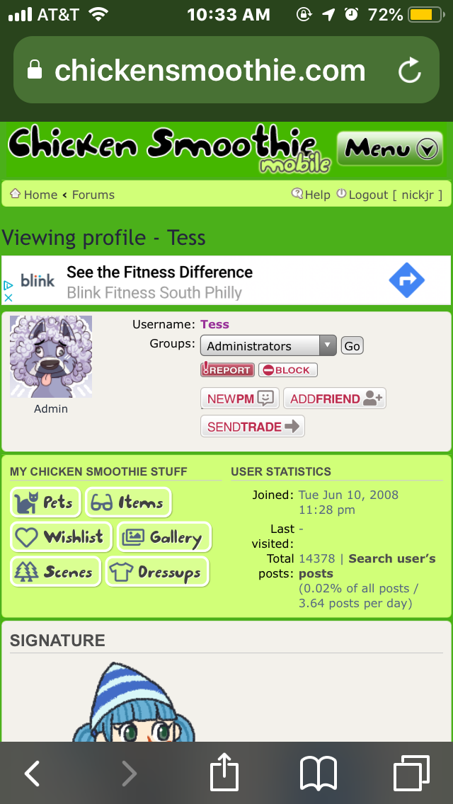
- FB56EBAC-9CEF-43FC-BA50-C20E167DCC7E.png (216.1 KiB) Viewed 115 times
Yes!! Two buttons per line now

Thank you!! Looks so much better than 2 on the first row and 1 per row for four rows lol
I’m not sure if it’s possible to set a button “theme” independently of the board theme... But maybe they can be set per board theme? I kinda liked the colors but they’re definitely out of place on CS Business. But now they look dull or even de-activated (“I guess Tess hasn’t adopted any pets” lol) because I’m on the bright green mobile layout, not CS Business xD If we can’t set the button theme independent of board theme, then maybe just have these duller buttons on CS Business and keep the color (and the smaller size so we can have two buttons per row on mobile lol) for the other themes? idk
Was your pet adopted December 18, any year, or December 24, 2011? It is most likely an older pet! CLICK ME to identify your pet!
Spread the word to end the word, because discrimination based on perceived or actual IQ/"intelligence" is no better than discrimination based on race, gender, etc.
Context, consistency, and clear antecedents are golden.
I neither read nor speak between the lines. But I will analyze your language.Often on phone
|||| Timezone: EDT/EST (
CS Time -4/-5)
|||| Very turbulent life IRL
Intentionally turned off signatures; PMs off June 2013 - June 2020, may turn off again later
Banner by Moonflight

It's been over 10 years since
my request, and I still love it. Thank you so much!
Character in avatar is from
CS's 2015 Sucrose City summer event. Border made by me in MS Paint, Windows 8.1 xD
-

nickjr
-
- Posts: 7108
- Joined: Thu Sep 25, 2008 10:54 am
- My pets
- My items
- My wishlist
- My gallery
- My scenes
- My dressups
- Trade with me
by nickjr » Fri Apr 05, 2019 3:05 am
Omg yes I love that. Suggested a few pages back that the buttons should be the same width for uniformity and omg that looks amazing 🤩
Was your pet adopted December 18, any year, or December 24, 2011? It is most likely an older pet! CLICK ME to identify your pet!
Spread the word to end the word, because discrimination based on perceived or actual IQ/"intelligence" is no better than discrimination based on race, gender, etc.
Context, consistency, and clear antecedents are golden.
I neither read nor speak between the lines. But I will analyze your language.Often on phone
|||| Timezone: EDT/EST (
CS Time -4/-5)
|||| Very turbulent life IRL
Intentionally turned off signatures; PMs off June 2013 - June 2020, may turn off again later
Banner by Moonflight
It's been over 10 years since
my request, and I still love it. Thank you so much!
Character in avatar is from
CS's 2015 Sucrose City summer event. Border made by me in MS Paint, Windows 8.1 xD
-
nickjr
-
- Posts: 7108
- Joined: Thu Sep 25, 2008 10:54 am
- My pets
- My items
- My wishlist
- My gallery
- My scenes
- My dressups
- Trade with me
Who is online
Users browsing this forum: No registered users and 8 guests


