
Small update to forum buttons, user page, foe list
Re: Small update to forum buttons, user page, foe list
![]() by TyrannosaurusWreck » Sat Apr 06, 2019 2:18 am
by TyrannosaurusWreck » Sat Apr 06, 2019 2:18 am
thank you for the new update!! <3
╔═══════════════════╗
║
║
║
║
║
║
╚═══════════════════╝
║
║
║
║
║
║
║
║
║
║
║
║
║
❝To a canary‚ a cat is a monster.
We’re just used to being the cat.❞
║We’re just used to being the cat.❞
║
║
║
║
║
║
╚═══════════════════╝
╭xxxxxxxxxxxxxxxxxxxxxx╮
xxxhi, im red. im an idiot
xxxxwhos just trying their best.
xxxi like video games, drawing,
xxxxxxxand gifting people.
xxxinsects deserve more love
╰xxxxxxxxxxxxxxxxxxxxxx╯
╭xxxxxxxxxxxxxxxxxxxxxx╮
xxxxxx

xxxxxxxxxx
x i want to be a paleontologist
x when i grow up! my dreamies
xxx are: UR flower, UR bee
╰xxxxxxxxxxxxxxxxxxxxxx╯
xxxxxx
xxxxxxxxxx
x i want to be a paleontologist
x when i grow up! my dreamies
xxx are: UR flower, UR bee
╰xxxxxxxxxxxxxxxxxxxxxx╯
-

TyrannosaurusWreck - Posts: 2300
- Joined: Sat May 12, 2018 3:05 am
- My pets
- My items
- My wishlist
- My gallery
- My scenes
- My dressups
- Trade with me
Re: Small update to forum buttons, user page, foe list
![]() by Guest » Sat Apr 06, 2019 4:24 am
by Guest » Sat Apr 06, 2019 4:24 am
@kerstin
Wouldn't they just need to make the buttons all the same size to make them line up in a nicer way? I think that making the buttons the same size would solve this problem
Wouldn't they just need to make the buttons all the same size to make them line up in a nicer way? I think that making the buttons the same size would solve this problem
- Guest
Re: Small update to forum buttons, user page, foe list
![]() by Celozon » Sat Apr 06, 2019 4:32 am
by Celozon » Sat Apr 06, 2019 4:32 am
Lolly_CGC wrote:@kerstin
Wouldn't they just need to make the buttons all the same size to make them line up in a nicer way? I think that making the buttons the same size would solve this problem
I believe they were referring to the suggestions users were making on making optional settings to change the sizes, similar to the way we can pick which theme we want, users were asking for something like that but for different sizes or placements of the buttons.


-

Celozon - Global Moderator
- Posts: 22656
- Joined: Thu Oct 08, 2009 12:41 pm
- My pets
- My items
- My wishlist
- My gallery
- My scenes
- My dressups
- Trade with me
Re: Small update to forum buttons, user page, foe list
![]() by 'Jordan » Sat Apr 06, 2019 7:37 am
by 'Jordan » Sat Apr 06, 2019 7:37 am
I personally like the colorful version 1 a bit better. It feels like they fit the overall site theme a bit more.
Maybe someday we could get an option to switch between different button styles? That way every user can pick which look they prefer, just like the site styles.
Maybe someday we could get an option to switch between different button styles? That way every user can pick which look they prefer, just like the site styles.
[size=85]
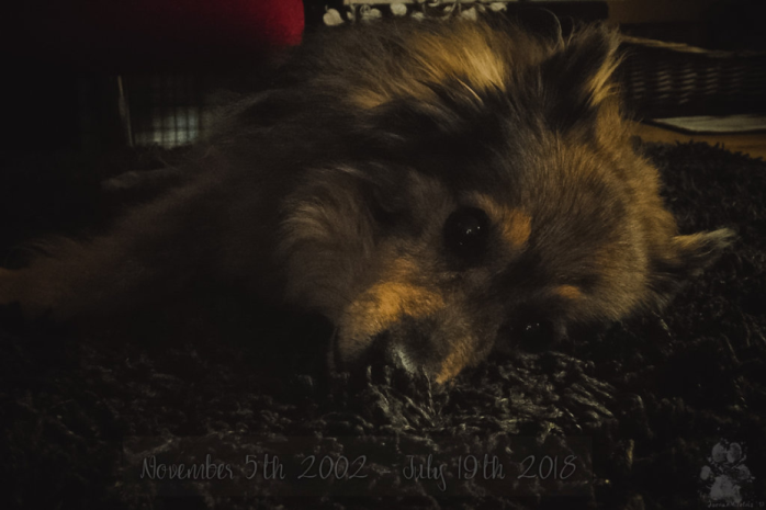
Benji, November 5th, 2002 - July 19th, 2018
[/size]
-

'Jordan - Posts: 5763
- Joined: Thu Jan 15, 2015 1:54 pm
- My pets
- My items
- My wishlist
- My gallery
- My scenes
- My dressups
- Trade with me
Re: Small update to forum buttons, user page, foe list
![]() by Keero » Sat Apr 06, 2019 7:45 am
by Keero » Sat Apr 06, 2019 7:45 am
- Ahh, loving the compromise! I use the CS business theme so the colorful buttons felt greatly out of place for me. It'll take some getting used to but I most certainly think this is a useful update as it makes things more accessible. As others have suggested, it would be great if we could customize them a bit- choose the style and perhaps the size (as I prefer to keep everything on the smaller side). Nevertheless, thank you for the update! It's always nice to know CS is striving to improve!
█ Keyo !
█ male (he/him)
█ tired vet student &
█ exotic animal vet tech
█ Discord: keyode
█ male (he/him)
█ tired vet student &
█ exotic animal vet tech
█ Discord: keyode
‗ ‗ ‗ ‗‗‗‗‗‗‗‗‗‗‗‗‗‗‗‗‗
❝ 𝔹𝕦𝕥 𝕞𝕪 𝕕𝕖𝕒𝕣 𝕞𝕒𝕟, 𝓇𝑒𝒶𝓁𝒾𝓉𝓎
𝕚𝕤 𝕠𝕟𝕝𝕪 𝕒 ℝ𝕠𝕣𝕤𝕔𝕙𝕒𝕔𝕙 𝕚𝕟𝕜-𝕓𝕝𝕠𝕥,
𝕪𝕠𝕦 𝕜𝕟𝕠𝕨. ❞ -𝒜𝓁𝒶𝓃 𝒲𝒶𝓉𝓉𝓈
‗ ‗ ‗ ‗‗‗‗‗‗‗‗‗‗‗‗‗‗‗‗‗
❝ 𝔹𝕦𝕥 𝕞𝕪 𝕕𝕖𝕒𝕣 𝕞𝕒𝕟, 𝓇𝑒𝒶𝓁𝒾𝓉𝓎
𝕚𝕤 𝕠𝕟𝕝𝕪 𝕒 ℝ𝕠𝕣𝕤𝕔𝕙𝕒𝕔𝕙 𝕚𝕟𝕜-𝕓𝕝𝕠𝕥,
𝕪𝕠𝕦 𝕜𝕟𝕠𝕨. ❞ -𝒜𝓁𝒶𝓃 𝒲𝒶𝓉𝓉𝓈
‗ ‗ ‗ ‗‗‗‗‗‗‗‗‗‗‗‗‗‗‗‗‗
‗ ‗ ‗ ‗‗‗‗‗‗‗‗‗‗‗‗‗‗‗‗‗ ‗ ‗ ‗
sometimes here, sometimes not
┐(’~`;)┌
fun fact: I own a paraplegic sun conure!
‗ ‗ ‗ ‗‗‗‗‗‗‗‗‗‗‗‗‗‗‗‗‗ ‗ ‗ ‗
sometimes here, sometimes not
┐(’~`;)┌
fun fact: I own a paraplegic sun conure!
‗ ‗ ‗ ‗‗‗‗‗‗‗‗‗‗‗‗‗‗‗‗‗ ‗ ‗ ‗
-

Keero - Posts: 21729
- Joined: Wed Apr 29, 2009 4:01 pm
- My pets
- My items
- My wishlist
- My gallery
- My scenes
- My dressups
- Trade with me
Re: Small update to forum buttons, user page, foe list
![]() by Winstalgia » Sat Apr 06, 2019 8:35 am
by Winstalgia » Sat Apr 06, 2019 8:35 am
I'm slowly warming up to it like I said I would and I actually like the grey better. c:

adult
Hi! Call me Rain or Wins! hope all is well.
I love philosophy, paradoxes, and thought
experiments. Fermi paradox is my favorite.
Really avid blink-182 fan! I love their music.
I also really like DnD and fantasy stuff.
Currently working on a visual novel!
"𝖎𝖘 𝖘𝖎𝖑𝖛𝖊𝖗 𝖆𝖓𝖉 𝖌𝖔𝖑𝖉."
-

Winstalgia - Posts: 13113
- Joined: Sat Feb 25, 2017 12:52 pm
- My pets
- My items
- My wishlist
- My gallery
- My scenes
- My dressups
- Trade with me
Re: Small update to forum buttons, user page, foe list
![]() by Lostfairy » Sat Apr 06, 2019 8:39 am
by Lostfairy » Sat Apr 06, 2019 8:39 am
I'm still not a fan of the huge buttons in the profile. It's just... so distracting and I keep scrolling down to trade people or check their gallery or whatever only to realize it's right there at the top. The trade button I have to really look for? It's so random and seeing friend's profiles make me cringe with how many huge buttons and how random and chaotic they look. And the link to a person's choice of website? Why is the font size bigger then our interests on mobile...? That's weird to me.
Also, I keep almost pressing the giant RED report button when I mean to quote something. It'd be nice if it was a white button? The red is really distracting and draws all the attention away from the real focus, the post.
I'll probably SLOWLY get used to the big profile buttons but that red report button is so awful and distracting. Also, I wish the buttons in the profile were not so chaotic? It looks a little out of order to me.
I'd still hugely appreciate this being a board preference. I'm grateful that this site likes to try and improve but for people who liked how it was before, a board preference just seems like the most polite answer. <33

she/her // christian // infp // 4w5 // live laugh love
-

Lostfairy - Posts: 9700
- Joined: Tue Sep 12, 2017 8:12 am
- My pets
- My items
- My wishlist
- My gallery
- My scenes
- My dressups
- Trade with me
Re: Small update to forum buttons, user page, foe list
![]() by VampireMessageNinja » Sat Apr 06, 2019 11:23 am
by VampireMessageNinja » Sat Apr 06, 2019 11:23 am
To anyone who didn't see it yet, there's a suggestion to be able to toggle the new buttons over here:
Forum/viewtopic.php?f=6&t=4057806
Enjoy hope it's okay that I post the link here
Forum/viewtopic.php?f=6&t=4057806
Enjoy hope it's okay that I post the link here


WME pixel by fantasy girl
~~~~~~~~~~~~~~~
<- My WMEs ->
My Range Trotters
My adoptables
My characters
~~~~~~~~~~~~~~~
Terrarium Deer by Applejack
~~~~~~~~~~~~~~~
<- My WMEs ->
My Range Trotters
My adoptables
My characters
~~~~~~~~~~~~~~~
Terrarium Deer by Applejack
-

VampireMessageNinja - Posts: 7813
- Joined: Tue Dec 20, 2011 12:22 am
- My pets
- My items
- My wishlist
- My gallery
- My scenes
- My dressups
- Trade with me
Re: Small update to forum buttons, user page, foe list
![]() by Meduz » Sun Apr 07, 2019 1:42 am
by Meduz » Sun Apr 07, 2019 1:42 am
I much prefer the second version of these buttons but I do wish the pets, wishlist, gallery etc. buttons all lined up a bit nicer. Maybe making them all the same size would be better?
The thing I've found most difficult is not having to scroll to send a trade and that button moving.
It'll take some getting used to but after a while it's such a minor change we won't notice it.
The thing I've found most difficult is not having to scroll to send a trade and that button moving.
It'll take some getting used to but after a while it's such a minor change we won't notice it.

-

Meduz - Posts: 3303
- Joined: Fri Aug 24, 2012 2:16 am
- My pets
- My items
- My wishlist
- My gallery
- My scenes
- My dressups
- Trade with me
Re: Small update to forum buttons, user page, foe list
![]() by cswolf. » Sun Apr 07, 2019 9:50 am
by cswolf. » Sun Apr 07, 2019 9:50 am
This is a very cute update. It's also very easy to follow and I think that the newer users will appreciate it very much.

signature now loading...
-

cswolf. - Posts: 88863
- Joined: Sun Mar 06, 2011 6:38 am
- My pets
- My items
- My wishlist
- My gallery
- My scenes
- My dressups
- Trade with me
Who is online
Users browsing this forum: No registered users and 14 guests