
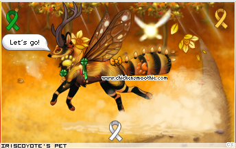
What the color orange means to me, is being brave in the face of adversity; When it looks like the sky is doing dark and the world is crumbling down around you, be Brave. It won't last forever. I included bits of green to imply the coming growth of better times and opportunity if one just keeps on going. The awareness ribbons also speak specifically to this theme to me. White for those who have an invisible disability, yellow for hope, and green for mental health.
My pet, Be Impossible, is never alone on her journey as her hope shines bright behind her. She knows that where ever she's going, it's better than what's behind her and the orange all around her is a reminder to be brave, because she needs to keep going. Don't stop, keep going! <3
Bravery in a Small Orange Hope
"Bravery in a Small Orange Hope" by IrisCoyote
| Category | "Your Favorite Color!" |
| Items used | 24 |
| Log in to vote for this dressup | |
1 post
• Page 1 of 1
Bravery in a Small Orange Hope
![]() by IrisCoyote » Thu Mar 21, 2024 7:42 am
by IrisCoyote » Thu Mar 21, 2024 7:42 am

-
IrisCoyote - Posts: 35
- Joined: Mon Dec 15, 2008 10:22 am
- My pets
- My items
- My wishlist
- My gallery
- My scenes
- My dressups
- Trade with me
1 post
• Page 1 of 1
Who is online
Users browsing this forum: No registered users and 2 guests