
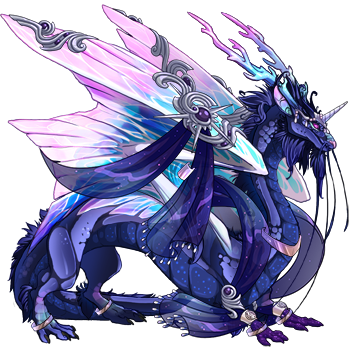
in the meantime, maybe you could do this gal instead? https://toyhou.se/1521981.juno
Closed for now
Forum rules
Art theft is not tolerated here. Do not copy/trace/edit/use anybody's pictures without their express permission.
If you are unsure, read the full art rules here.
Art theft is not tolerated here. Do not copy/trace/edit/use anybody's pictures without their express permission.
If you are unsure, read the full art rules here.
Re: ●Ichi's Art Shop●[Critique for Art][OPEN]
![]() by demonsdays » Mon Mar 12, 2018 7:02 am
by demonsdays » Mon Mar 12, 2018 7:02 am
oooh, no unfortunately  i'll have to make her one
in the meantime, maybe you could do this gal instead? https://toyhou.se/1521981.juno
in the meantime, maybe you could do this gal instead? https://toyhou.se/1521981.juno

-

demonsdays - Posts: 981
- Joined: Thu Oct 25, 2012 6:54 am
- My pets
- My items
- My wishlist
- My gallery
- My scenes
- My dressups
- Trade with me
Re: ●Ichi's Art Shop●[Critique for Art][OPEN]
![]() by toy20243 » Mon Mar 12, 2018 7:22 am
by toy20243 » Mon Mar 12, 2018 7:22 am
Oh i love your art <3

On this piece my main concern is her left leg. When you look at her shoes they look about the same size, but when you look up at her legs it almost looks like you cut one in half and popped it into a slightly different pose. If we were to remove that leg it would look like shes leaning forwards in excitement. When we pop it back on im assuming shes doing a slightly swivel like pose, so when doing that pose i suggest to focus on her thighs first, when you look at them they seem to be two very different sizes, even though they are fairly close to each other and should be similar sizes once you get that down the rest of the leg sizing should be easy! Now onto her head. if you remove her face she seems to be facing another direction than she is with her face, for example when you take a lego person and just swivel their wig to the side a bit, it looks okay but akward at the same time. Then from where im assuming her skull is the horn appears to be... directly ontop of her head... I suggest using multiple different layers so you can 'remove pieces' of her so you can see how she could look with different faces and ect. you can also flip the art piece around everyone and a while to check on portions! It helps me a LOT.

On this piece my main concern is her left leg. When you look at her shoes they look about the same size, but when you look up at her legs it almost looks like you cut one in half and popped it into a slightly different pose. If we were to remove that leg it would look like shes leaning forwards in excitement. When we pop it back on im assuming shes doing a slightly swivel like pose, so when doing that pose i suggest to focus on her thighs first, when you look at them they seem to be two very different sizes, even though they are fairly close to each other and should be similar sizes once you get that down the rest of the leg sizing should be easy! Now onto her head. if you remove her face she seems to be facing another direction than she is with her face, for example when you take a lego person and just swivel their wig to the side a bit, it looks okay but akward at the same time. Then from where im assuming her skull is the horn appears to be... directly ontop of her head... I suggest using multiple different layers so you can 'remove pieces' of her so you can see how she could look with different faces and ect. you can also flip the art piece around everyone and a while to check on portions! It helps me a LOT.
𝒮𝓌𝑒𝑒𝓉 𝒟𝓇𝑒𝒶𝓂𝓈
⋆⁺₊⋆ ☾⋆⁺₊⋆
⋆⁺₊⋆ ☾⋆⁺₊⋆
-
toy20243 - Posts: 6871
- Joined: Wed Aug 13, 2014 8:06 pm
- My pets
- My items
- My wishlist
- My gallery
- My scenes
- My dressups
- Trade with me
Re: ●Ichi's Art Shop●[Critique for Art][OPEN]
![]() by cocogerber13 » Mon Mar 12, 2018 11:19 am
by cocogerber13 » Mon Mar 12, 2018 11:19 am
Hello! I already really like your art, so I hope my advice can help! ^^
(For overall figure drawing, I find this video kind of helpful!)

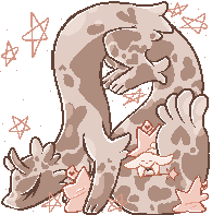
Onto this piece, though- while I do like the style and stance overall, I do think there are a few parts that had a few unnecessary lines. Exaggerating parts of a drawing art good for expression, but for a regular drawing they aren’t always needed (the points on the arm and hand are a part of that). While there is a difference between the arm and forearm and a bump near the wrist in that positioning, they usually aren’t all that obvious. There still should be a different in thickness of the arm itself, but the lines to the side (in my opinion) stand out a bit more than they need to. As for the legs, there is a slight curve on the front part, but usually they are more straight because of the bone (I know that this bit is kind of referring back to more realistic anatomy, but it also helps the posture in drawings to look better IMO). Also, the overall proportions seem okay to me, but the hand does seem a bit big to me.
I really like how you shade as well, and though I’m not completely sure what kind of shading you are looking into doing, whenever I do soft-cell shading, I tend to end up drawing over the shading with a very slight different shade/intensity where I want it to get dark and continue doing that until I feel the shadow goes where I want it to before using a blur brush. Idk if it’s just the program I use for not, but the blending and blur brushes change the actual colour (like light brown to darker brown turns to red the more I use the tool?) and drawing over the shadows with different shades works for me.
I hope this helped a bit!
(For overall figure drawing, I find this video kind of helpful!)
Onto this piece, though- while I do like the style and stance overall, I do think there are a few parts that had a few unnecessary lines. Exaggerating parts of a drawing art good for expression, but for a regular drawing they aren’t always needed (the points on the arm and hand are a part of that). While there is a difference between the arm and forearm and a bump near the wrist in that positioning, they usually aren’t all that obvious. There still should be a different in thickness of the arm itself, but the lines to the side (in my opinion) stand out a bit more than they need to. As for the legs, there is a slight curve on the front part, but usually they are more straight because of the bone (I know that this bit is kind of referring back to more realistic anatomy, but it also helps the posture in drawings to look better IMO). Also, the overall proportions seem okay to me, but the hand does seem a bit big to me.
I really like how you shade as well, and though I’m not completely sure what kind of shading you are looking into doing, whenever I do soft-cell shading, I tend to end up drawing over the shading with a very slight different shade/intensity where I want it to get dark and continue doing that until I feel the shadow goes where I want it to before using a blur brush. Idk if it’s just the program I use for not, but the blending and blur brushes change the actual colour (like light brown to darker brown turns to red the more I use the tool?) and drawing over the shadows with different shades works for me.
I hope this helped a bit!
╔══════════════════════════════════╗
☾ Hello! I'm Cocogerber13, °˖✧
but feel free to call me Coco.
toyhouse|IG|art gallery|
DA|FR|art fight|Character shop
♢I write, draw, and rp!♢
Current interests: Fionna & Cake/Adventure Time, Genshin Impact, HSR, Baldur’s Gate 3, botw, fe3h, Ev.e, MILGRAM, ORV & Twisted Wonderland


╚══════════════════════════════════╝
☾ Hello! I'm Cocogerber13, °˖✧
but feel free to call me Coco.
toyhouse|IG|art gallery|
DA|FR|art fight|Character shop
♢I write, draw, and rp!♢
Current interests: Fionna & Cake/Adventure Time, Genshin Impact, HSR, Baldur’s Gate 3, botw, fe3h, Ev.e, MILGRAM, ORV & Twisted Wonderland

╚══════════════════════════════════╝
-

cocogerber13 - Posts: 12024
- Joined: Sun Dec 01, 2013 1:53 pm
- My pets
- My items
- My wishlist
- My gallery
- My scenes
- My dressups
- Trade with me
Re: ●Ichi's Art Shop●[Critique for Art][OPEN]
![]() by Ichi Mitsugi » Mon Mar 12, 2018 11:57 am
by Ichi Mitsugi » Mon Mar 12, 2018 11:57 am
demonsdays wrote:oooh, no unfortunately
in the meantime, maybe you could do this gal instead? https://toyhou.se/1521981.juno
sure, I'll get around to it ^w^!

-

Ichi Mitsugi - Posts: 1191
- Joined: Wed Nov 05, 2014 8:49 am
- My pets
- My items
- My wishlist
- My gallery
- My scenes
- My dressups
- Trade with me
Re: ●Ichi's Art Shop●[Critique for Art][OPEN]
![]() by Ichi Mitsugi » Mon Mar 12, 2018 12:24 pm
by Ichi Mitsugi » Mon Mar 12, 2018 12:24 pm
toy20243 wrote:Oh i love your art <3
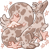
On this piece my main concern is her left leg. When you look at her shoes they look about the same size, but when you look up at her legs it almost looks like you cut one in half and popped it into a slightly different pose. If we were to remove that leg it would look like shes leaning forwards in excitement. When we pop it back on im assuming shes doing a slightly swivel like pose, so when doing that pose i suggest to focus on her thighs first, when you look at them they seem to be two very different sizes, even though they are fairly close to each other and should be similar sizes once you get that down the rest of the leg sizing should be easy! Now onto her head. if you remove her face she seems to be facing another direction than she is with her face, for example when you take a lego person and just swivel their wig to the side a bit, it looks okay but akward at the same time. Then from where im assuming her skull is the horn appears to be... directly ontop of her head... I suggest using multiple different layers so you can 'remove pieces' of her so you can see how she could look with different faces and ect. you can also flip the art piece around everyone and a while to check on portions! It helps me a LOT.
★★★★★★★ 7 stars~
You see, the thing is she is leaning forward ;w; she's doing the florina or gordin thingy (sort of). I kinda wanted her to be dragging one of her legs behind her but even then, yeah that thigh shouldn't be so small ^^; I should try and get better at drawing perspective. I didn't copy-paste the legs either since I thought one leg was more sharper (pointy? idk, edges aren't as smooth) than the other.
I also think the head and face are weird and I'm still trying to figure out how to place those :D
I'm also fairly certain I mentioned her horn being at the top of her head earlier when someone mentioned something about the ears and yes her horn is suppose to be closer to the top of her head than her forehead, although I'm thinking about moving it lower since it looks weird on her brother counterpart and I need them to twin.
Overall not bad~ Lemme know what art type you want and send your reffy, too~~
-
Ichi Mitsugi - Posts: 1191
- Joined: Wed Nov 05, 2014 8:49 am
- My pets
- My items
- My wishlist
- My gallery
- My scenes
- My dressups
- Trade with me
Re: ●Ichi's Art Shop●[Critique for Art][OPEN]
![]() by Ichi Mitsugi » Mon Mar 12, 2018 12:31 pm
by Ichi Mitsugi » Mon Mar 12, 2018 12:31 pm
cocogerber13 wrote:Hello! I already really like your art, so I hope my advice can help! ^^
(For overall figure drawing, I find this video kind of helpful!)
Onto this piece, though- while I do like the style and stance overall, I do think there are a few parts that had a few unnecessary lines. Exaggerating parts of a drawing art good for expression, but for a regular drawing they aren’t always needed (the points on the arm and hand are a part of that). While there is a difference between the arm and forearm and a bump near the wrist in that positioning, they usually aren’t all that obvious. There still should be a different in thickness of the arm itself, but the lines to the side (in my opinion) stand out a bit more than they need to. As for the legs, there is a slight curve on the front part, but usually they are more straight because of the bone (I know that this bit is kind of referring back to more realistic anatomy, but it also helps the posture in drawings to look better IMO). Also, the overall proportions seem okay to me, but the hand does seem a bit big to me.
I really like how you shade as well, and though I’m not completely sure what kind of shading you are looking into doing, whenever I do soft-cell shading, I tend to end up drawing over the shading with a very slight different shade/intensity where I want it to get dark and continue doing that until I feel the shadow goes where I want it to before using a blur brush. Idk if it’s just the program I use for not, but the blending and blur brushes change the actual colour (like light brown to darker brown turns to red the more I use the tool?) and drawing over the shadows with different shades works for me.
I hope this helped a bit!
★★★★★★★★ 8 stars!
I remember someone mentioning how the legs are straight on the inside, but I don't think too many people mentioned the arms and especially the wrist, and now looking back at it I can't unsee it owo
Also don't feel bad about referring back to realistic anatomy, I'm just not a fan of people telling me I need to draw realistic first before I can do anything else.<-- I'll leave this in bold in case anybody comes scrolling by so they can see this since I'm not good at clarifying.
Overall anatomy tips are good~ I also like the video -w-~
For shading I'm not actually looking to get into soft-cell shading, I really like Keeggy'sstyle overall and pretty much want to inherit those godly skills. It's why I've been deferring back to solid cell shading as of late, I think it'd be a lot better to adjust that habit now than later down on the road.
Overall also good job! Lemme know what type of art you want and send a reffy too~
-
Ichi Mitsugi - Posts: 1191
- Joined: Wed Nov 05, 2014 8:49 am
- My pets
- My items
- My wishlist
- My gallery
- My scenes
- My dressups
- Trade with me
Re: ●Ichi's Art Shop●[Critique for Art][OPEN]
![]() by cocogerber13 » Mon Mar 12, 2018 1:33 pm
by cocogerber13 » Mon Mar 12, 2018 1:33 pm
Thanks so much, and I’m glad I could help! ^^ I totally understand the shading part!
Could I please have a halfbod of this girl? I’m not picky about what she’s wearing or anything, but don’t be afraid to ask if you need anything! Thank you again! ^^
Could I please have a halfbod of this girl? I’m not picky about what she’s wearing or anything, but don’t be afraid to ask if you need anything! Thank you again! ^^
╔══════════════════════════════════╗
☾ Hello! I'm Cocogerber13, °˖✧
but feel free to call me Coco.
toyhouse|IG|art gallery|
DA|FR|art fight|Character shop
♢I write, draw, and rp!♢
Current interests: Fionna & Cake/Adventure Time, Genshin Impact, HSR, Baldur’s Gate 3, botw, fe3h, Ev.e, MILGRAM, ORV & Twisted Wonderland
╚══════════════════════════════════╝
-
cocogerber13 - Posts: 12024
- Joined: Sun Dec 01, 2013 1:53 pm
- My pets
- My items
- My wishlist
- My gallery
- My scenes
- My dressups
- Trade with me
Re: ●Ichi's Art Shop●[Critique for Art][OPEN]
![]() by toy20243 » Mon Mar 12, 2018 1:54 pm
by toy20243 » Mon Mar 12, 2018 1:54 pm
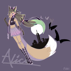
I just got this babe <3 a head shot or a chibi bust of her would be amazing <3 (though if you do a bust ignore her pink outfit thingy... i plan on giving her a kelp like bra and skirt... just dont have it drawn up yet lol)
https://sta.sh/01jl6jhmsg8d
https://sta.sh/01jl6jhmsg8d
𝒮𝓌𝑒𝑒𝓉 𝒟𝓇𝑒𝒶𝓂𝓈
⋆⁺₊⋆ ☾⋆⁺₊⋆
⋆⁺₊⋆ ☾⋆⁺₊⋆
-
toy20243 - Posts: 6871
- Joined: Wed Aug 13, 2014 8:06 pm
- My pets
- My items
- My wishlist
- My gallery
- My scenes
- My dressups
- Trade with me
Re: ●Ichi's Art Shop●[Critique for Art][OPEN]
![]() by Ichi Mitsugi » Mon Apr 23, 2018 1:52 pm
by Ichi Mitsugi » Mon Apr 23, 2018 1:52 pm
b ump~
I'm baaaaack~ <3
I'm baaaaack~ <3
-
Ichi Mitsugi - Posts: 1191
- Joined: Wed Nov 05, 2014 8:49 am
- My pets
- My items
- My wishlist
- My gallery
- My scenes
- My dressups
- Trade with me
-
Ichi Mitsugi - Posts: 1191
- Joined: Wed Nov 05, 2014 8:49 am
- My pets
- My items
- My wishlist
- My gallery
- My scenes
- My dressups
- Trade with me