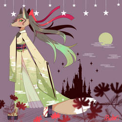
Closed for now
Forum rules
Art theft is not tolerated here. Do not copy/trace/edit/use anybody's pictures without their express permission.
If you are unsure, read the full art rules here.
Art theft is not tolerated here. Do not copy/trace/edit/use anybody's pictures without their express permission.
If you are unsure, read the full art rules here.
-

Ichi Mitsugi - Posts: 1191
- Joined: Wed Nov 05, 2014 8:49 am
- My pets
- My items
- My wishlist
- My gallery
- My scenes
- My dressups
- Trade with me
-

Ichi Mitsugi - Posts: 1191
- Joined: Wed Nov 05, 2014 8:49 am
- My pets
- My items
- My wishlist
- My gallery
- My scenes
- My dressups
- Trade with me
-

Ichi Mitsugi - Posts: 1191
- Joined: Wed Nov 05, 2014 8:49 am
- My pets
- My items
- My wishlist
- My gallery
- My scenes
- My dressups
- Trade with me
-

Ichi Mitsugi - Posts: 1191
- Joined: Wed Nov 05, 2014 8:49 am
- My pets
- My items
- My wishlist
- My gallery
- My scenes
- My dressups
- Trade with me
-

Ichi Mitsugi - Posts: 1191
- Joined: Wed Nov 05, 2014 8:49 am
- My pets
- My items
- My wishlist
- My gallery
- My scenes
- My dressups
- Trade with me
-

Ichi Mitsugi - Posts: 1191
- Joined: Wed Nov 05, 2014 8:49 am
- My pets
- My items
- My wishlist
- My gallery
- My scenes
- My dressups
- Trade with me
-

Ichi Mitsugi - Posts: 1191
- Joined: Wed Nov 05, 2014 8:49 am
- My pets
- My items
- My wishlist
- My gallery
- My scenes
- My dressups
- Trade with me
-

Ichi Mitsugi - Posts: 1191
- Joined: Wed Nov 05, 2014 8:49 am
- My pets
- My items
- My wishlist
- My gallery
- My scenes
- My dressups
- Trade with me
-

Ichi Mitsugi - Posts: 1191
- Joined: Wed Nov 05, 2014 8:49 am
- My pets
- My items
- My wishlist
- My gallery
- My scenes
- My dressups
- Trade with me
Re: ●Ichi's Art Shop●[Critique for Art][OPEN]
Alright, I'm a bit rusty with critique so bear with me here.
I'd like to start off by saying I really like your artwork, you totally nail that anime-esque style!
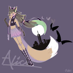
I'm mainly going to be using this piece as an example.
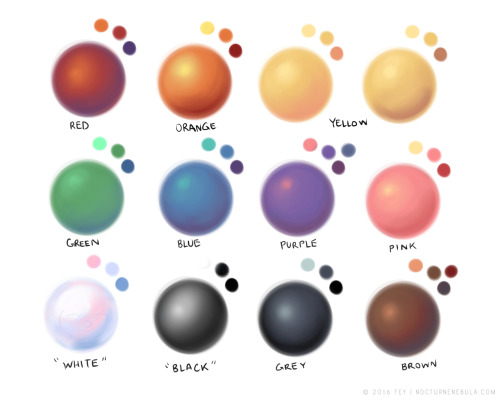
1. You've got some pretty good color theory going on with your shading, but there are a few areas where it could be improved upon.
The yellow on the shirt is shaded with a darker, more saturated, and more orange color. This is great! An excellent display of color theory. However, in the places where you have used highlights they are done with solid or transparent white (I.e the stockings and the skin) It can work quite nicely in some places, especially like what you've done with the eyes! but although it's not a necessity, adding more diverse highlights can really, truly make all the difference. I think the drawing above would pop even more if you added a lighter color to the yellows!
Source
As you can see, highlights can make a piece of artwork pop, and oftentimes all you have to do is reverse the process you use to get a shading color!
2. Next up I'm going to talk a little bit about some of the proportions and anatomy. Overall, they're pretty solid and proportions can be suggestive but I notice the feet on this piece specifically are short, especially if compared to the hands! I'd recommend essentially stretching them out so that they're a bit longer and more proportionate to everything else.
3. You seem to draw the cheek bone bump(?) a bit low for the mouth placement. Where the head is facing can affect this a lot!
Straight ahead: The mouth and cheekbone are relatively equal
Looking up: The cheekbone is somewhat below the mouth
Looking down: The mouth is somewhat below the cheekbone
Here's a good reference of this!

Source
4. Now as for the hair, I notice some of the tufts are a bit too thick for that flowy anime style you're going for! I recommend breaking them up into smaller sections or making them thinner. :>
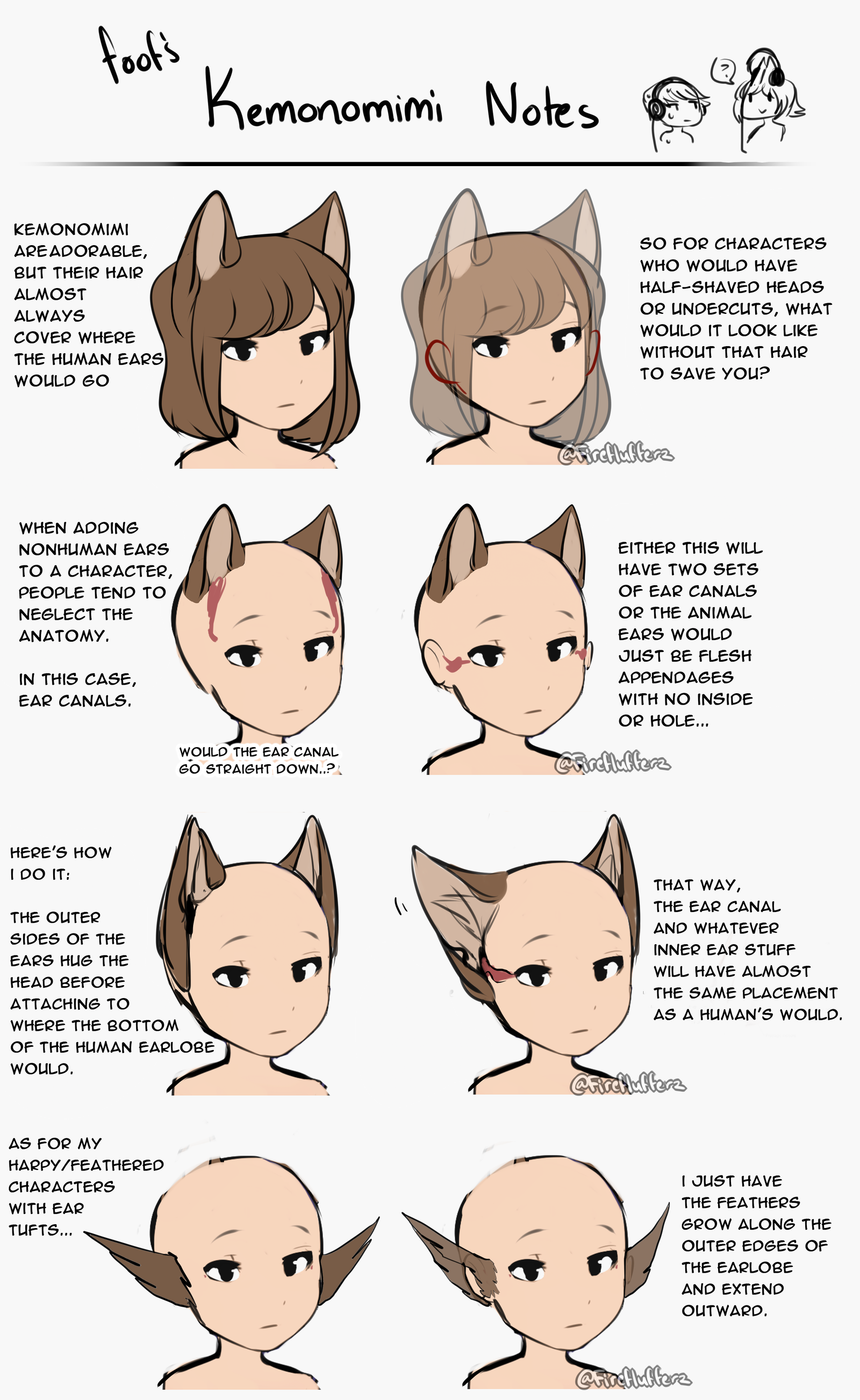
5. And this is my last piece of advice but perhaps it's a minor detail! The way you drew the ears here goes against ear canal anatomy for both animals and humans! The ears always kinda connect to the side of the head. This tutorial here puts it into words better than I can!
Source
Whew, hopefully I was able to give you some helpful advice here! It was a lot of fun examining your artwork and finding where it could be improved upon. :>
I've also drawn up a redline for the last two points to give you a better idea. ^^

I'd like to start off by saying I really like your artwork, you totally nail that anime-esque style!
I'm mainly going to be using this piece as an example.
1. You've got some pretty good color theory going on with your shading, but there are a few areas where it could be improved upon.
The yellow on the shirt is shaded with a darker, more saturated, and more orange color. This is great! An excellent display of color theory. However, in the places where you have used highlights they are done with solid or transparent white (I.e the stockings and the skin) It can work quite nicely in some places, especially like what you've done with the eyes! but although it's not a necessity, adding more diverse highlights can really, truly make all the difference. I think the drawing above would pop even more if you added a lighter color to the yellows!

Source
As you can see, highlights can make a piece of artwork pop, and oftentimes all you have to do is reverse the process you use to get a shading color!
2. Next up I'm going to talk a little bit about some of the proportions and anatomy. Overall, they're pretty solid and proportions can be suggestive but I notice the feet on this piece specifically are short, especially if compared to the hands! I'd recommend essentially stretching them out so that they're a bit longer and more proportionate to everything else.
3. You seem to draw the cheek bone bump(?) a bit low for the mouth placement. Where the head is facing can affect this a lot!
Straight ahead: The mouth and cheekbone are relatively equal
Looking up: The cheekbone is somewhat below the mouth
Looking down: The mouth is somewhat below the cheekbone
Here's a good reference of this!

Source
4. Now as for the hair, I notice some of the tufts are a bit too thick for that flowy anime style you're going for! I recommend breaking them up into smaller sections or making them thinner. :>
5. And this is my last piece of advice but perhaps it's a minor detail! The way you drew the ears here goes against ear canal anatomy for both animals and humans! The ears always kinda connect to the side of the head. This tutorial here puts it into words better than I can!

Source
Whew, hopefully I was able to give you some helpful advice here! It was a lot of fun examining your artwork and finding where it could be improved upon. :>
I've also drawn up a redline for the last two points to give you a better idea. ^^

-

Paper.dragonflies - Posts: 7502
- Joined: Mon Jul 29, 2013 1:20 am
- My pets
- My items
- My wishlist
- My gallery
- My scenes
- My dressups
- Trade with me
Who is online
Users browsing this forum: B-a-b-y-B-e-a-r and 4 guests

