
Signature Criticism! [v.1]
Re: Signature Criticism! [v.1]
![]() by SecondSolstice » Fri Feb 23, 2024 7:05 pm
by SecondSolstice » Fri Feb 23, 2024 7:05 pm
Very compact ! I like it, very simple as well


┏xxxxxxxxxxxxxxxxxxxxxxxxxxxxxxxxxxx┓

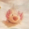
Vincent/Leo | he/it/axo |
Axolotl enthusiast! dm me about axolotls anytime if curious !
Dms always open!
feel free to dm me about any of my interests !

♠
┖xxxxxxxxxxxxxxxxxxxxxxxxxxxxxxxxxxx┚
Vincent/Leo | he/it/axo |
Axolotl enthusiast! dm me about axolotls anytime if curious !
Dms always open!
feel free to dm me about any of my interests !
♠
┖xxxxxxxxxxxxxxxxxxxxxxxxxxxxxxxxxxx┚
-
SecondSolstice - Posts: 1106
- Joined: Sun Jun 11, 2023 6:56 am
- My pets
- My items
- My wishlist
- My gallery
- My scenes
- My dressups
- Trade with me
Re: Signature Criticism! [v.1]
![]() by horsestigers » Sat Feb 24, 2024 5:12 am
by horsestigers » Sat Feb 24, 2024 5:12 am
- i like how organised it is and the little gifs are so cute! i think that the broken images could be removed or replaced, and the text in the middle could be split up into three lines instead of two so it doesn't break out of the box, but other than that it looks great c:


-

horsestigers - Posts: 2388
- Joined: Sun Dec 17, 2017 10:35 am
- My pets
- My items
- My wishlist
- My gallery
- My scenes
- My dressups
- Trade with me
Re: Signature Criticism! [v.1]
![]() by _SmollJellyfish_ » Sat Feb 24, 2024 5:13 am
by _SmollJellyfish_ » Sat Feb 24, 2024 5:13 am
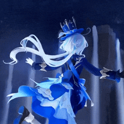
Simple and organized, the colors go great with the GIF, I love it!
┄ ┄ ┄ ┄ ┄ ┄ ┄ ┄ ┄ ┄ ┄ ┄
 FURINA DE FONTAINE
 |Infp|♋︎|he/him|Writer|


FURINA DE FONTAINE |Infp|♋︎|he/him|Writer| -

_SmollJellyfish_ - Posts: 5044
- Joined: Mon Oct 10, 2022 9:37 am
- My pets
- My items
- My wishlist
- My gallery
- My scenes
- My dressups
- Trade with me
Re: Signature Criticism! [v.1]
![]() by skrundle » Sat Feb 24, 2024 5:59 pm
by skrundle » Sat Feb 24, 2024 5:59 pm
- i love the color scheme soo much! only complaint i have is that the gif doesn’t line up to the right of everything else instead of below it, but im on mobile rn so it could just be a formatting issue

♡
♡
♡
♡
♡
♡
♡
♡
♡
♡
♡
♡
♡
♡
♡
♡
♡
♡
♡
♡
♡
╭xxxxxxxxxxxxxxxxxxxxxxxxxxxx╮
jo | she/her | INFP
autistic adult, west coast USA
musician - flutist & pianist
i love cats, digital art, and miku
don't be shy! i don't bite ♥︎
╰xxxxxxxxxxxxxxxxxxxxxxxxxxxx╯
jo | she/her | INFP
autistic adult, west coast USA
musician - flutist & pianist
i love cats, digital art, and miku
don't be shy! i don't bite ♥︎
╰xxxxxxxxxxxxxxxxxxxxxxxxxxxx╯
─── ・ 。゚☆: *.☽ .* :☆゚. ───


♡
♡
♡
♡
♡
♡
♡
♡
♡
♡
♡
♡
♡
♡
♡
♡
♡
♡
♡
♡
♡

-

skrundle - Posts: 3483
- Joined: Fri Mar 23, 2012 11:14 am
- My pets
- My items
- My wishlist
- My gallery
- My scenes
- My dressups
- Trade with me
Re: Signature Criticism! [v.1]
![]() by The Ghost Of You » Sat Feb 24, 2024 7:43 pm
by The Ghost Of You » Sat Feb 24, 2024 7:43 pm
hi!! :D honestly love your sig! the only thing that i'd change is to add an image above the center text to sort of balance out the space a little more. other than that, it's perfect!
new sig soon, just watched the crow! (loved it!)

𝐁𝐔𝐓 𝐈𝐅 𝐈'𝐌───────✦✦✦─-


𝐖𝐄'𝐑𝐄 𝐒𝐎───❥❥❥─

𝐁𝐔𝐓 𝐈𝐅 𝐈'𝐌───────✦✦✦─-


-─────────
❥ The name's Kai!
∙ he/they ∙ adult ∙
I love ben 10, mlp,
one punch man and
all of the spiderman
animated shows! c:
∙ he/they ∙ adult ∙
I love ben 10, mlp,
one punch man and
all of the spiderman
animated shows! c:
bring me the horizon, mcr,
make them suffer, slipknot,
limp bizkit & black veil brides
𝐖𝐄'𝐑𝐄 𝐅𝐀𝐋𝐋𝐈𝐍𝐆 𝐎𝐔𝐓make them suffer, slipknot,
limp bizkit & black veil brides
𝐖𝐄'𝐑𝐄 𝐒𝐎───❥❥❥─
-

The Ghost Of You - Posts: 12131
- Joined: Tue Oct 02, 2018 11:31 am
- My pets
- My items
- My wishlist
- My gallery
- My scenes
- My dressups
- Trade with me
Re: Signature Criticism! [v.1]
![]() by glitter » Mon Feb 26, 2024 8:26 am
by glitter » Mon Feb 26, 2024 8:26 am
hey! love the color scheme and the formatting. lots of attention to detail and making sure the images are cropped right so everything lines up. one thing that slightly bothers me tho is that the amount of distinct pictures is pretty overwhelming. i kinda wish all the filler cloud pics were from one big picture rather than a bunch of seperate ones.


[𝐠𝐥𝐢𝐭𝐭𝐞𝐫]
════════════(¯`· she/her •
..`·. x est • ·´¯)
entp • 5w4 .·´
════════════..`·. x est • ·´¯)
entp • 5w4 .·´
.


════════════════════════
old user is royale | pms welcome.
uni student majoring in stats and
ecology/evolution [ ♡ ] trade me!

░░ ░░░░░
┌ ✦ collections│⮡ dwrf hamsters
│owls, squid, bats
│pps bws, '19 fae,
│'11 faire, bettas !
└ my sig shop
════════════


-

glitter - Posts: 15129
- Joined: Thu Oct 27, 2016 1:06 pm
- My pets
- My items
- My wishlist
- My gallery
- My scenes
- My dressups
- Trade with me
Re: Signature Criticism! [v.1]
![]() by glitter » Sun Mar 03, 2024 5:14 am
by glitter » Sun Mar 03, 2024 5:14 am
this game died again :( - bump
[𝐠𝐥𝐢𝐭𝐭𝐞𝐫]
════════════(¯`· she/her •
..`·. x est • ·´¯)
entp • 5w4 .·´
════════════..`·. x est • ·´¯)
entp • 5w4 .·´
.
════════════════════════
old user is royale | pms welcome.
uni student majoring in stats and
ecology/evolution [ ♡ ] trade me!
░░ ░░░░░
┌ ✦ collections│⮡ dwrf hamsters
│owls, squid, bats
│pps bws, '19 fae,
│'11 faire, bettas !
└ my sig shop
════════════
-
glitter - Posts: 15129
- Joined: Thu Oct 27, 2016 1:06 pm
- My pets
- My items
- My wishlist
- My gallery
- My scenes
- My dressups
- Trade with me
Re: Signature Criticism! [v.1]
![]() by _SmollJellyfish_ » Sun Mar 03, 2024 6:22 am
by _SmollJellyfish_ » Sun Mar 03, 2024 6:22 am
I love the gif, especially the little bunny!Its a pleasure for eyes!
┄ ┄ ┄ ┄ ┄ ┄ ┄ ┄ ┄ ┄ ┄ ┄
FURINA DE FONTAINE
|Infp|♋︎|he/him|Writer|
FURINA DE FONTAINE |Infp|♋︎|he/him|Writer| -
_SmollJellyfish_ - Posts: 5044
- Joined: Mon Oct 10, 2022 9:37 am
- My pets
- My items
- My wishlist
- My gallery
- My scenes
- My dressups
- Trade with me
Re: Signature Criticism! [v.1]
![]() by HyperfixationStation » Wed Mar 13, 2024 3:37 pm
by HyperfixationStation » Wed Mar 13, 2024 3:37 pm
a good signature with a just as great color scheme ! if i had a few criticisms for it , i'd probably say the asymmetry makes it mildly chaotic , and spaces the signature out awkwardly in some parts . a few stamps stick out a bit too much , but otherwise it's great !
▛xxxxxxxxxxxxxxxcurrent hyperfixationxxxxxxxxxxxxx▜
..x─*♪♪♪: *✧・゚: ─── ・ 。゚☆: *.☽ .* :☆゚. ───*✧・゚: *✧:─
▙ xx.xxxxxxxxxx☆ animation vs. videos ☆xxxxxxxxxxx▟


-

HyperfixationStation - Posts: 5238
- Joined: Thu Sep 13, 2018 1:23 pm
- My pets
- My items
- My wishlist
- My gallery
- My scenes
- My dressups
- Trade with me
Re: Signature Criticism! [v.1]
![]() by SilentMelody » Wed Mar 13, 2024 3:59 pm
by SilentMelody » Wed Mar 13, 2024 3:59 pm
- Great signature!! The only thing that sticks out to me is the "♪♪♪" with the Youtube link. It kinda breaks up the symmetry of the signature, maybe you could put the link in one of the moon or star symbols in the middle? Just a suggestion, everything looks good c:

mel | adult | she/her | bi
toyhouse - silentmelody
admin/staff for dcay on cs
RBT in ABA therapy for autism
B.S. in psychological sciences
status: recertifying for medical assisting
low activity, but i still check my pms!
-

SilentMelody - Posts: 16621
- Joined: Mon Feb 23, 2015 6:53 am
- My pets
- My items
- My wishlist
- My gallery
- My scenes
- My dressups
- Trade with me
Who is online
Users browsing this forum: Yandex and 7 guests