

username: Doglady88722
name: Azaelia
number: 31
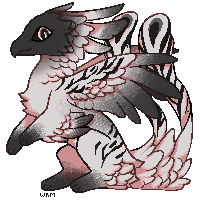
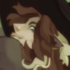
opinions/critique? This looks amazing! I love both of your styles, but I like this one a bit more.
Re: [kalon 1338] rooster
![]() by revvington » Wed Jan 24, 2018 9:41 am
by revvington » Wed Jan 24, 2018 9:41 am

-

revvington - Posts: 7998
- Joined: Fri Sep 16, 2016 11:16 am
- My pets
- My items
- My wishlist
- My gallery
- My scenes
- My dressups
- Trade with me
Re: [kalon 1338] rooster
![]() by Cyrano » Wed Jan 24, 2018 9:44 am
by Cyrano » Wed Jan 24, 2018 9:44 am
username:smith(ers)
name:Fallow
number:32
opinions/critique? I love this kals unique look but I just don't like how the tail is green and there are no other green accents other than the eyes. The style itself is really cute though. I do want to add something else though I like the green shade with that shade of orange. Very sweet combo.
-

Cyrano - Posts: 1600
- Joined: Fri Jul 28, 2017 11:37 am
- My pets
- My items
- My wishlist
- My gallery
- My scenes
- My dressups
- Trade with me
Re: [kalon 1338] rooster
![]() by Eiivanna » Wed Jan 24, 2018 9:48 am
by Eiivanna » Wed Jan 24, 2018 9:48 am
username: Eiivanna
name: Erri
number:33
opinions/critique? The bold outline is a statement but the fact that it is black isn't my cup of tea personally, I think the thick outline is actually quite nice but for a light coloured design like this it looks a tad off because of the black (a light colour would sway me on this), that being said it is very unique and would be a good way to make it more your style. I liked your old soft designs because the lines looked so calm and blended into the design so well, however this new style is expressive and I can see it working well in the future. It definately could be a defining characteristic of your designs. Also im not sure if it's just me but I see a slight halo behind the kal that really makes it pop out of the page, I like that, and the horizontal lines im not sure if they are part of the kalon design or the style but I like them a lot too. (Unrelated the the art style I love the colour scheme of this kid)
That's just my opinion and initial thoughts though c:


-
Eiivanna - Posts: 241
- Joined: Thu Jan 11, 2018 9:53 am
- My pets
- My items
- My wishlist
- My gallery
- My scenes
- My dressups
- Trade with me
Re: [kalon 1338] rooster
![]() by uηsρεcifiεd ¢ryҏtiɗ » Wed Jan 24, 2018 9:51 am
by uηsρεcifiεd ¢ryҏtiɗ » Wed Jan 24, 2018 9:51 am
username: Drasheep
name: Sari
number: 34
opinions/critique? I quite like this design, the colors and patterns all look splendid! The only thing that throws me off are the lines, they kind of bother me a bit. (The grid-ish looking ones inside the coloring.) It's not too bad, it barely annoys me THAT much. I honestly love everything else about it!

-
uηsρεcifiεd ¢ryҏtiɗ - Posts: 2282
- Joined: Tue Dec 27, 2016 10:14 am
- My pets
- My items
- My wishlist
- My gallery
- My scenes
- My dressups
- Trade with me
Re: [kalon 1338] rooster
![]() by rain, » Wed Jan 24, 2018 9:57 am
by rain, » Wed Jan 24, 2018 9:57 am
- username: rain,
name: Aroye
number: 35
opinions/critique? ; This kalon is honestly a dream. I really love the simplicity of the design, as well as the colors used! It looks really realistic!
"She needs me. And I need her.
Its as simple as that."
🌧 kalons 🌧 my kalons 🌧 my pillowtails 🌧 pillowtails 🌧 work list 🌧
Its as simple as that."
🌧 kalons 🌧 my kalons 🌧 my pillowtails 🌧 pillowtails 🌧 work list 🌧
-

rain, - Posts: 7784
- Joined: Sun Feb 14, 2016 12:48 pm
- My pets
- My items
- My wishlist
- My gallery
- My scenes
- My dressups
- Trade with me
Re: [kalon 1338] rooster
![]() by doktor monty » Wed Jan 24, 2018 10:00 am
by doktor monty » Wed Jan 24, 2018 10:00 am
username: Doktor Monty
name: Han
number: 36
opinions/critique? I really like it! I'm sure you'll be able to continue experimenting with these nice styles and get amazing support ❤️
name: Han
number: 36
opinions/critique? I really like it! I'm sure you'll be able to continue experimenting with these nice styles and get amazing support ❤️
links wrote:
- ✦ { dok/stephv ✧ they/he/any ✧ occasionally online } ✦
- Howdy! I'm on here as often as I have the energy for it, so everything might be a little delayed with me! Feel free to check out my semi/open adopts, and if you're feeling adventurous click my dragoncave eggs too- my children thank you. Have a great day <3
-
doktor monty - Posts: 5404
- Joined: Sat Feb 09, 2013 2:57 pm
- My pets
- My items
- My wishlist
- My gallery
- My scenes
- My dressups
- Trade with me
Re: [kalon 1338] rooster
![]() by watts » Wed Jan 24, 2018 10:02 am
by watts » Wed Jan 24, 2018 10:02 am
- username: naomi !
name: cocoro
number: 37
opinions/critique?: i really like this, and your old style! this one gives me a bit of a computer-generated edgy look, and i really love that! i think it would be cool to see both of these styles used interchangeably!!

rpnt watts ; polyfrag DID system
it/they
apex legends || icon (c) tinivy @ tumblr
-

watts - Posts: 6182
- Joined: Mon Jul 27, 2015 11:18 am
- My pets
- My items
- My wishlist
- My gallery
- My scenes
- My dressups
- Trade with me
Re: [kalon 1338] rooster
![]() by Fwutter » Wed Jan 24, 2018 10:09 am
by Fwutter » Wed Jan 24, 2018 10:09 am
- username: Fwutter
name: Ari
number: 38
opinions/critique?: I really like this! It sorta reminds me of birds and I think that's what you went for. I love the coloring and shading! The colors go exponentially well together! Great job!!!

-

Fwutter - Posts: 8777
- Joined: Mon May 05, 2014 6:08 am
- My pets
- My items
- My wishlist
- My gallery
- My scenes
- My dressups
- Trade with me
Re: [kalon 1338] rooster
![]() by olive oil » Wed Jan 24, 2018 10:17 am
by olive oil » Wed Jan 24, 2018 10:17 am
- username: olive oil
name: Enver
number: 39
opinions/critique?: I like it!! Though I'm not quite sure if the lines on the design are part of the design or if it's part of the style? But if it's just part of the style, it's cool!! Makes the design look vintage, I like it.
█ ▐
█ ▐
█ ▐
█ ▐
█ ▐
█ ▐
█ ▐
█ ▐
█ ▐
█ ▐
█ ▐
█ ▐
█ ▐
█ ▐
█ ▐
█ ▐
█ ▐
█ ▐
█ ▐
█ ▐
█ ▐
█ ▐
█ ▐
█ ▐
█ ▐
█ ▐
█ ▐
█ ▐
█ ▐
█ ▐
█ ▐
█ ▐
█ ▐
█ ▐
█ ▐
█ ▐
█ ▐
█ ▐
█ ▐
█ ▐
█ ▐
█ ▐
█ ▐
█ ▐
█ ▐
█ ▐
█ ▐
█ ▐
█ ▐
signature is a wip lol
art to the left by me
kal storage
my deviantart
art to the left by me
kal storage
my deviantart
-

olive oil - Posts: 3788
- Joined: Sun Feb 19, 2012 10:23 am
- My pets
- My items
- My wishlist
- My gallery
- My scenes
- My dressups
- Trade with me
Re: [kalon 1338] rooster
![]() by Lillybear » Wed Jan 24, 2018 10:17 am
by Lillybear » Wed Jan 24, 2018 10:17 am
username: Lillybear
name: TBD
number: 40
opinions/critique? the color combination is beautiful and i love the use of the lines! it really adds a lot to it!
name: TBD
number: 40
opinions/critique? the color combination is beautiful and i love the use of the lines! it really adds a lot to it!
-
Lillybear - Posts: 5653
- Joined: Sat Dec 07, 2013 12:29 pm
- My pets
- My items
- My wishlist
- My gallery
- My scenes
- My dressups
- Trade with me
Who is online
Users browsing this forum: No registered users and 10 guests